MerchMuse
Logo Design

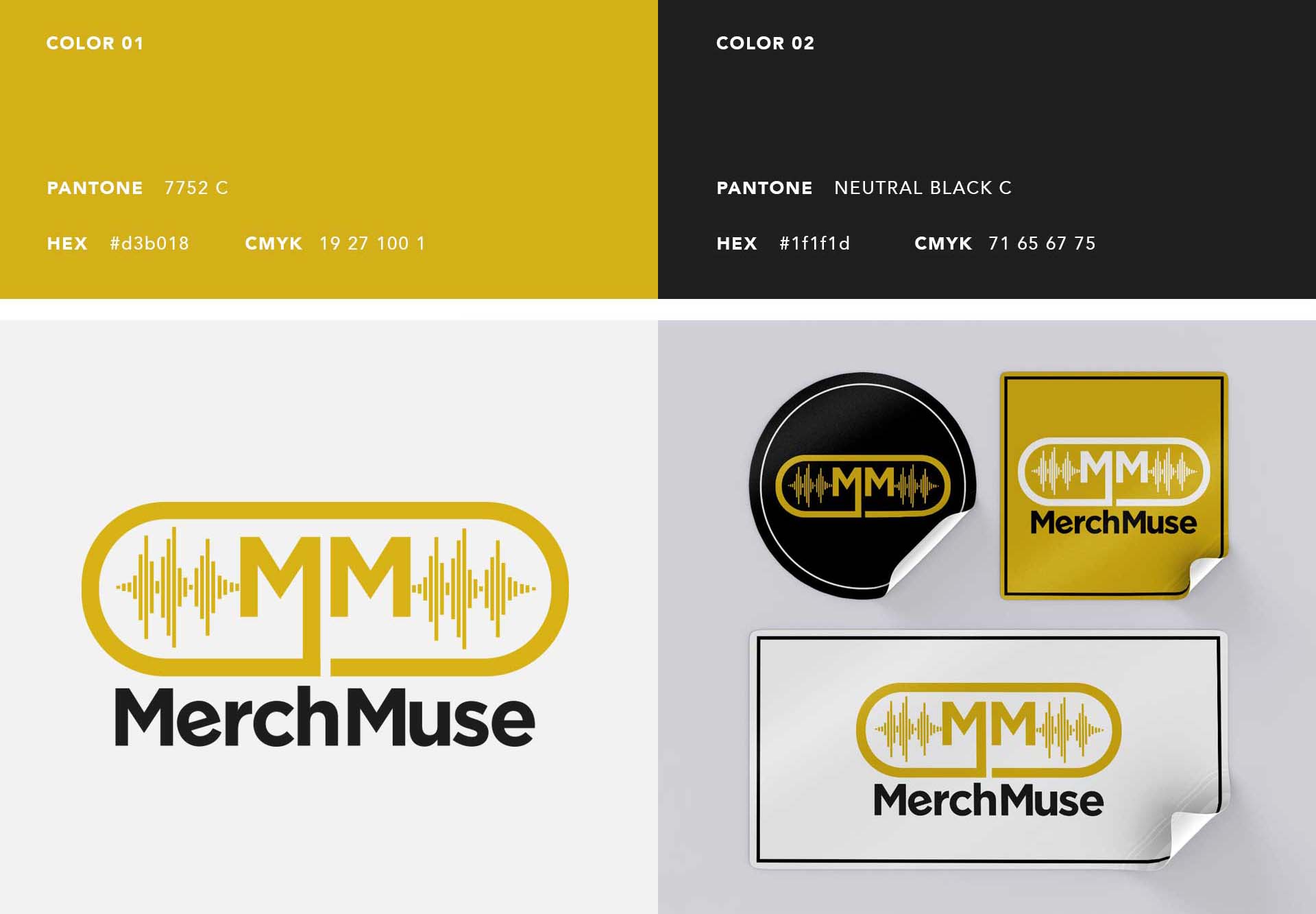
The design process for the MerchMuse branding began with the vision to create a logo that resonated deeply with the music industry. The central motif, a sound wave integrated into the abbreviation “MM” for MerchMuse, reflects the dynamism and vibrancy of music.
The choice of colors was deliberate; Pantone 7752 C, a bold yellow, evokes energy and creativity, while Neutral Black C adds sophistication and contrast, grounding the design.
Innovations in the design include the utilization of the sound wave pattern not only as a design element but as a symbol of sound and music, making the logo instantly recognizable to the target audience of music lovers and professionals. This was extended across various merchandise such as headphones, T-shirts, and promotional materials, ensuring brand consistency.
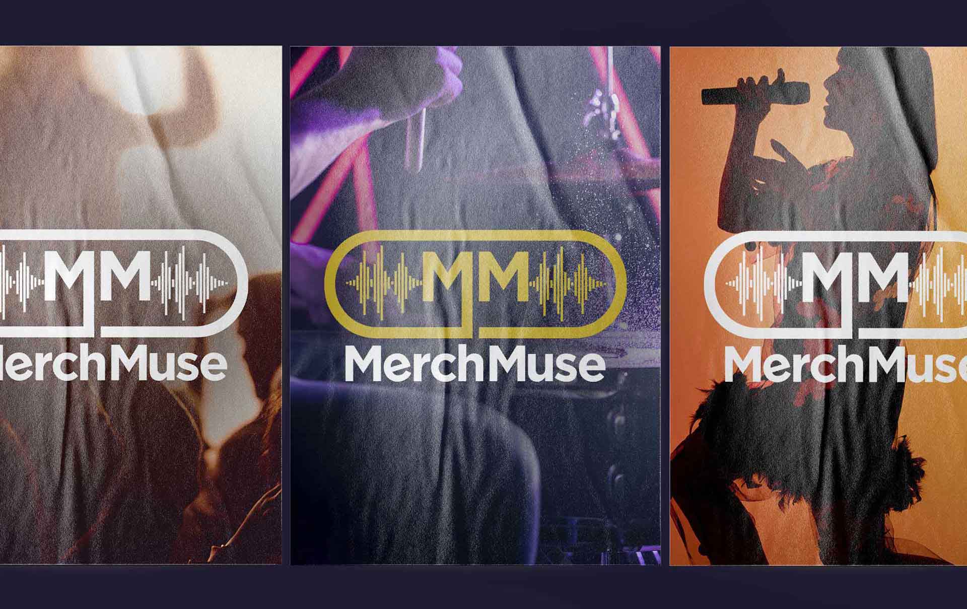
The adaptation of the logo across different media showcases its versatility, from digital displays to printed materials. Each application maintains the integrity of the sound wave design, reinforcing the brand’s connection to music and audio innovation. This strategic consistency helps in strengthening brand recall and enhancing the visual impact of the MerchMuse identity in the market.
